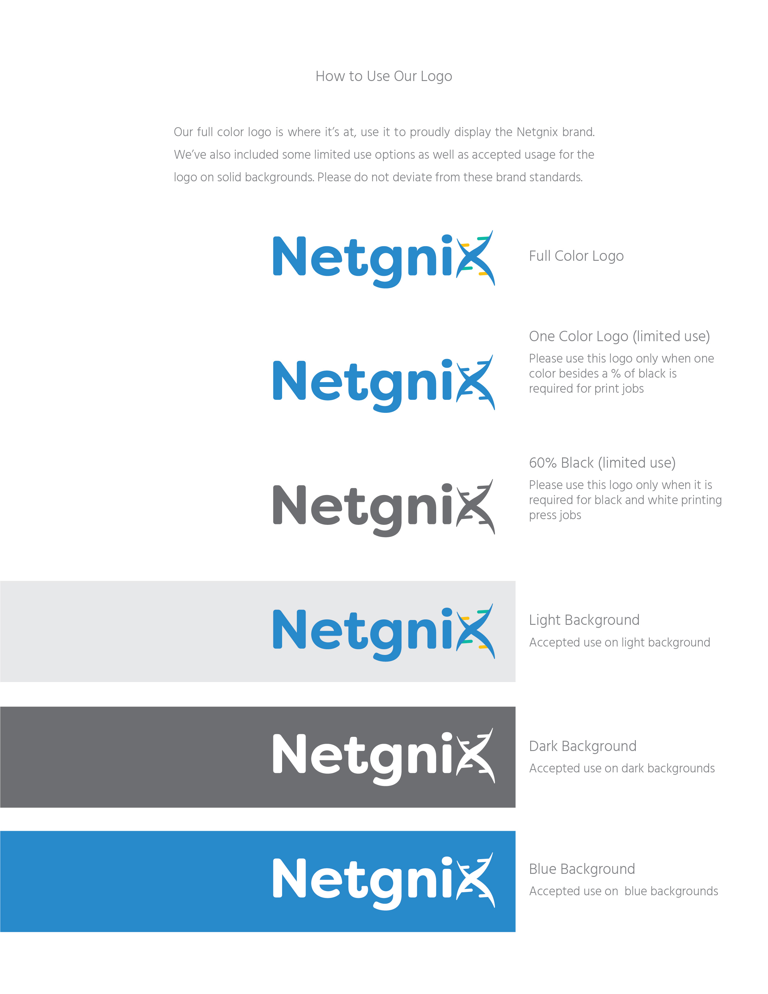
Netgnix Logo & Brand Standards Guide
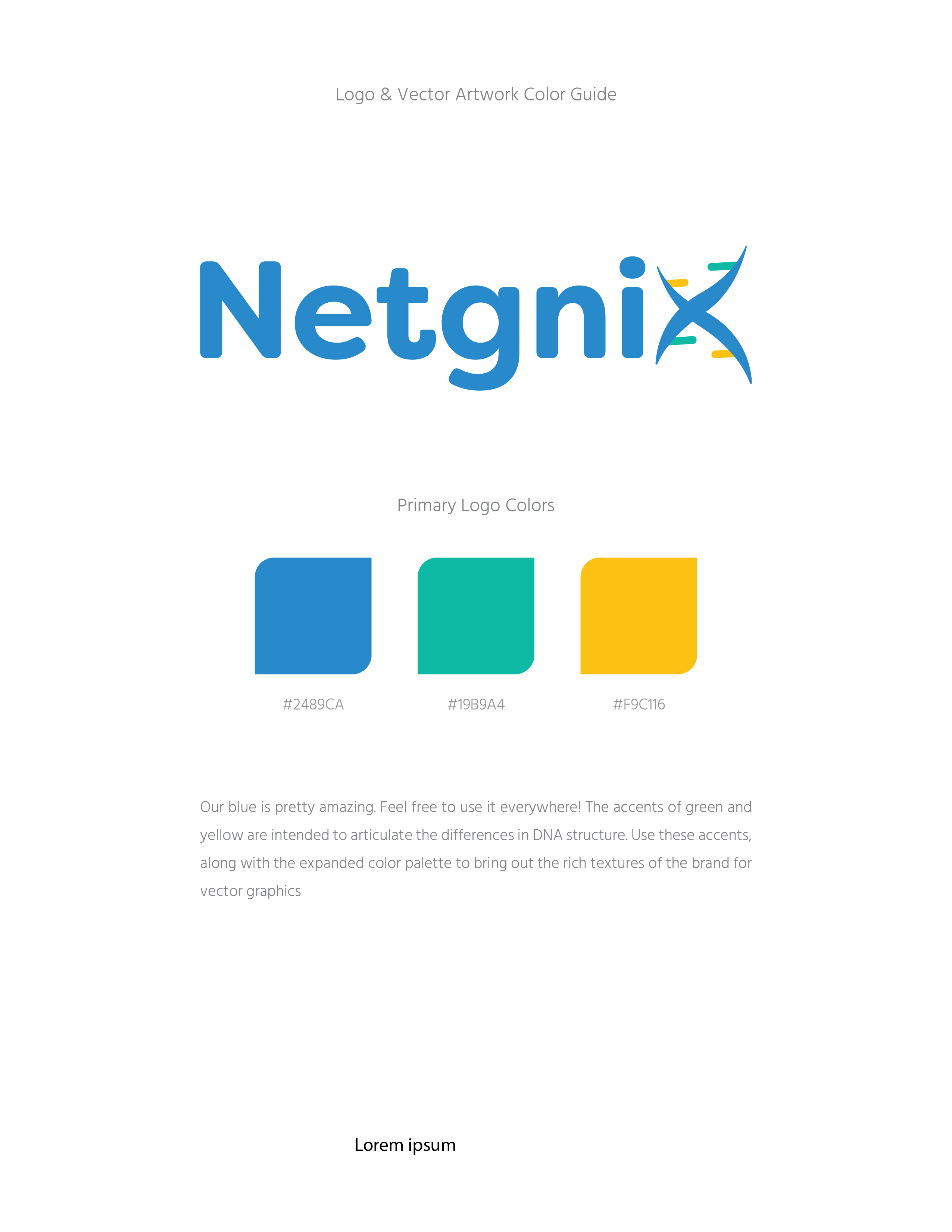
Netgnix is a DNA testing company similar to 23andMe.com and Familytreedna.com. They wanted a fresh look, yet similar enough to their old logo to retain brand recognition. I wanted to create something a little more playful, I also wanted to incorporate the accent colors, like the old logo, but more predominate. Especially if the logo were small, you would want those colors to stand out.
Old Netgnix Logo
New Netgnix Logo
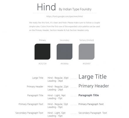
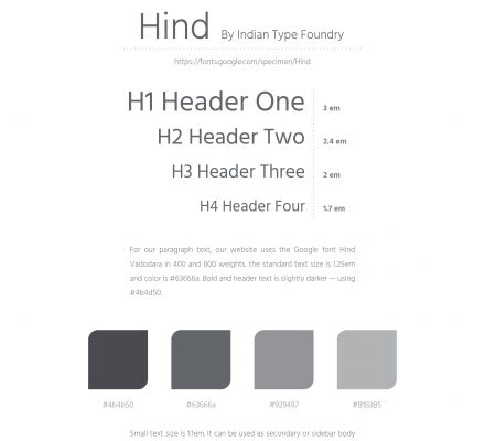
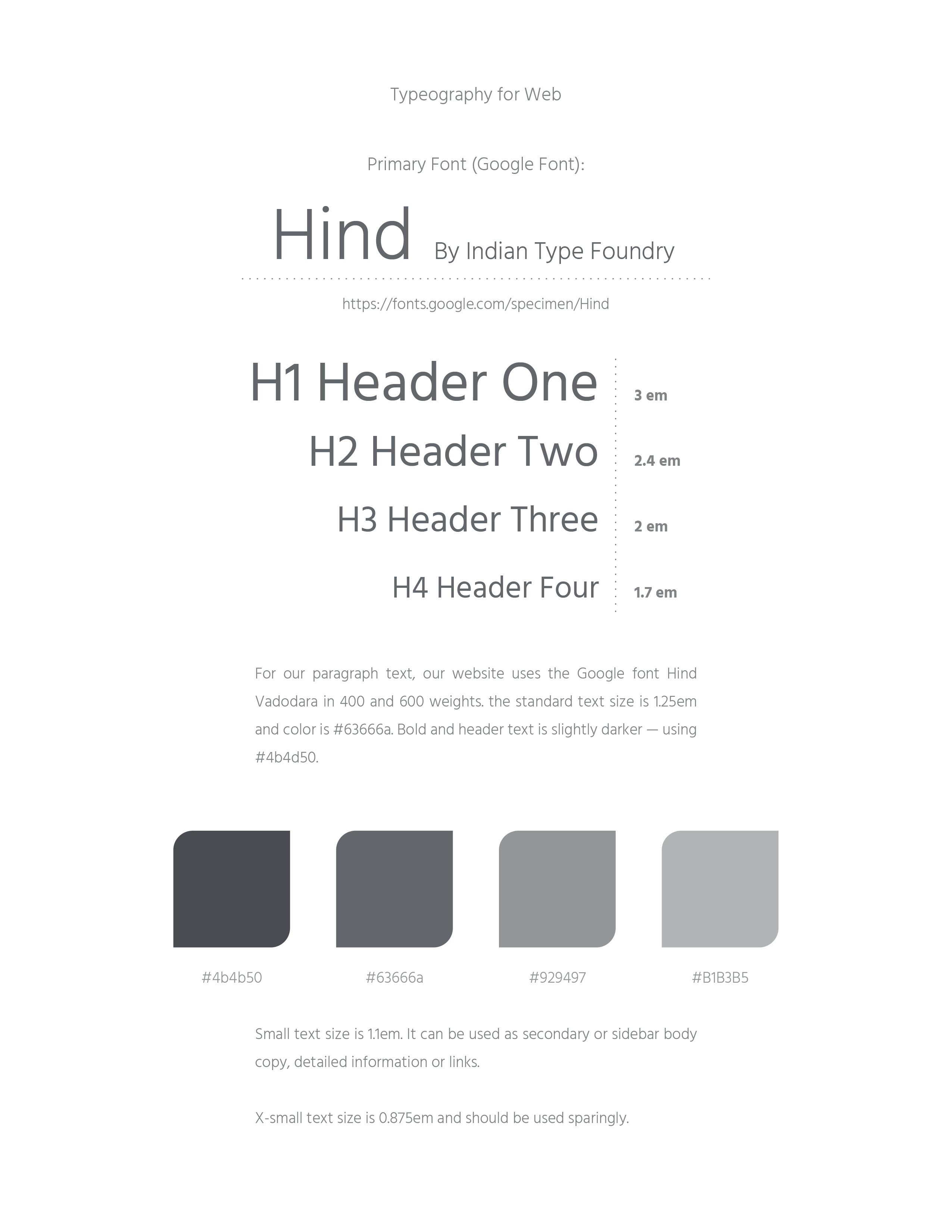
Netgnix Brand Standard Guide
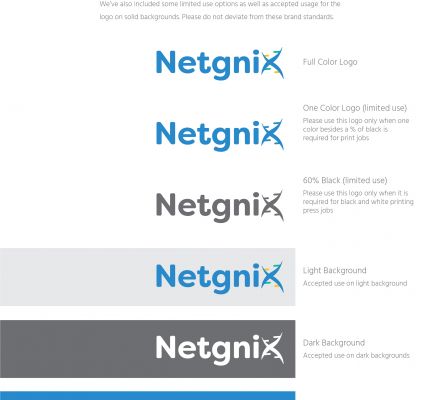
The brand standards for Netgnix were solidified once the final log and color theory had been flushed out. Review the guide below, it contains the logo, when and how to use the logo, the primary colors, as well as the expanded color palette. It is a project that continues to build, even now as the company becomes more established.
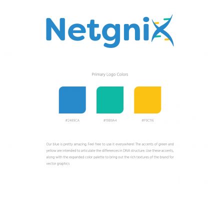
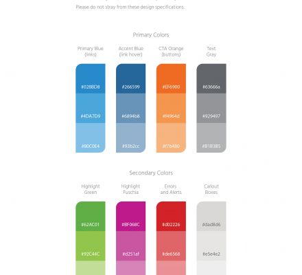
Netgnix Color Theory
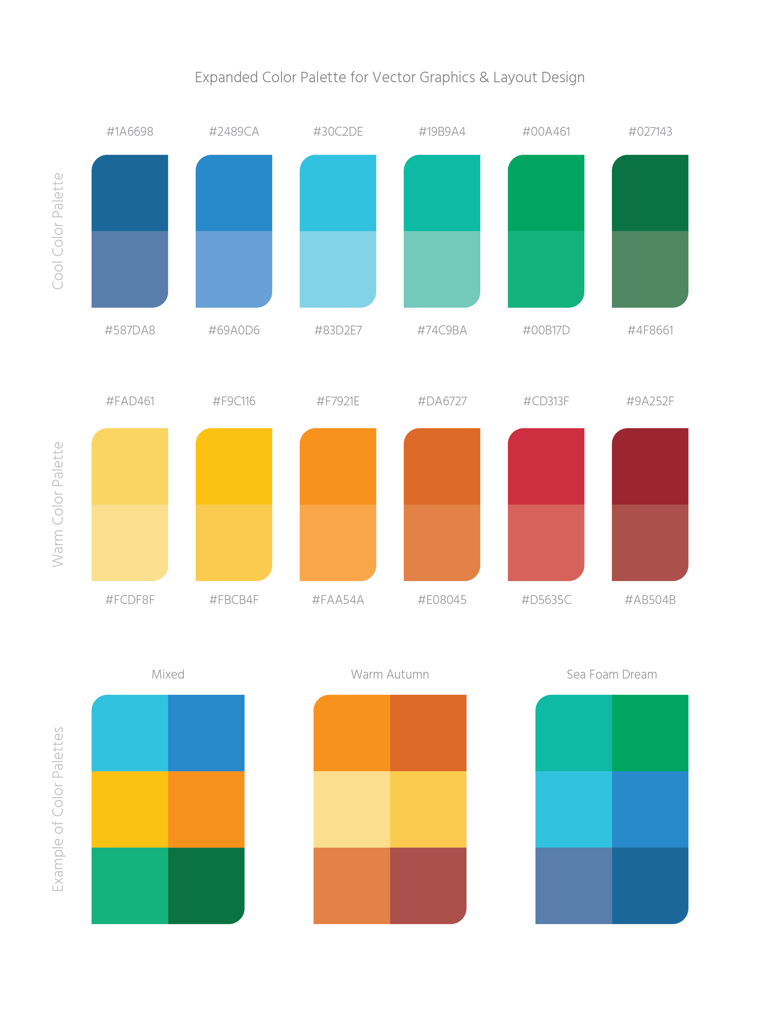
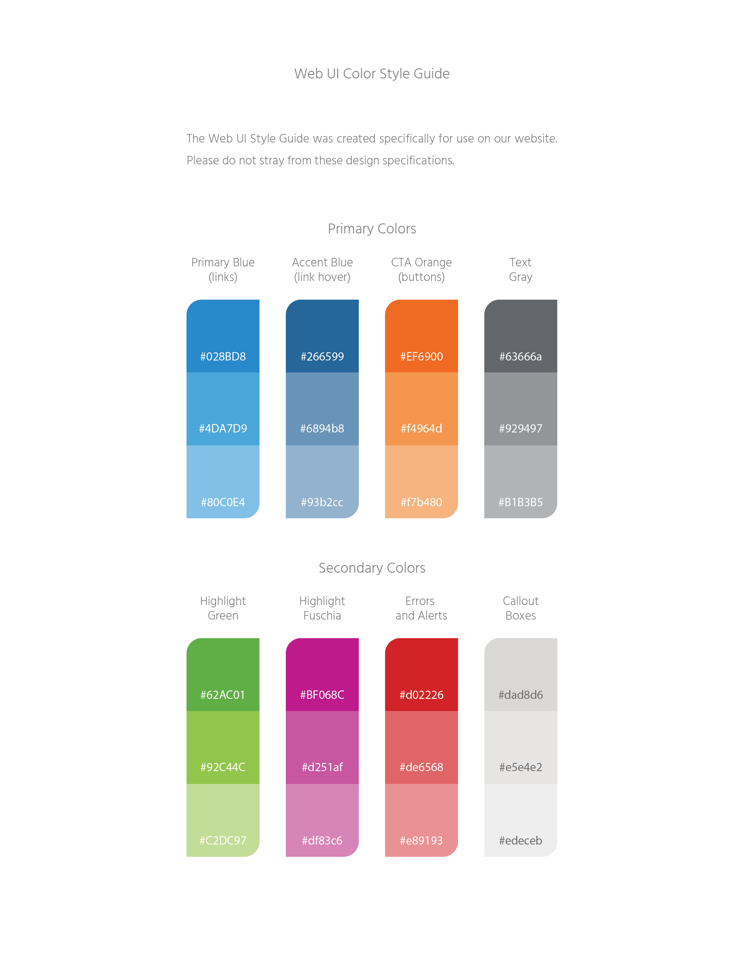
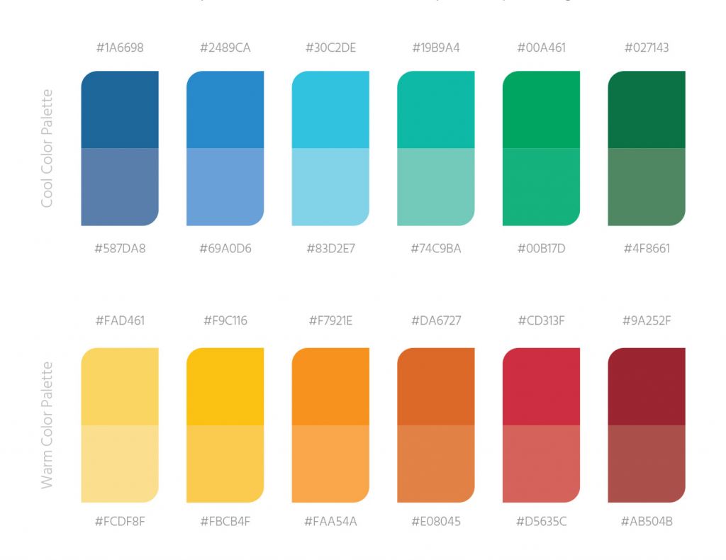
The initial three colors, blue, green and yellow, were expanded. This one done for one of two reasons. To increase the color pallet of the website dashboard and to set a standard for colors when creating vector graphics. We wanted to make sure that the brand had a cohesive set of colors that could be used at a designer’s discretion and to bring together the overall look and feel of the company.
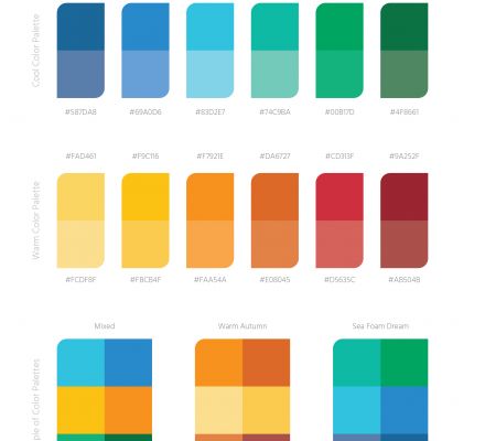
Expanded Color Palette
Color Combinations
